

Lighting up a gray commute
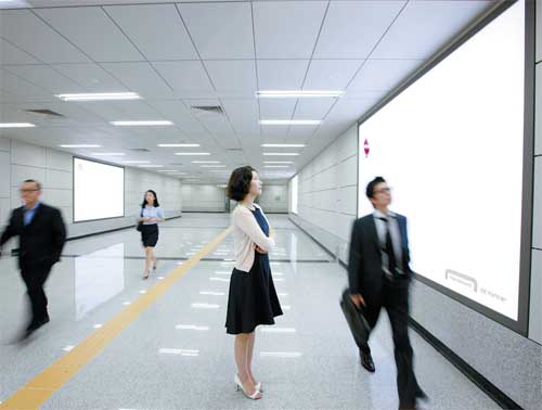
An empty billboard at the National Assembly Station on the recently opened line No. 9 is another example of the company’s creative design philosophy.
But recently these stops have had a different look about them, a unique appearance that stops commuters in their tracks.
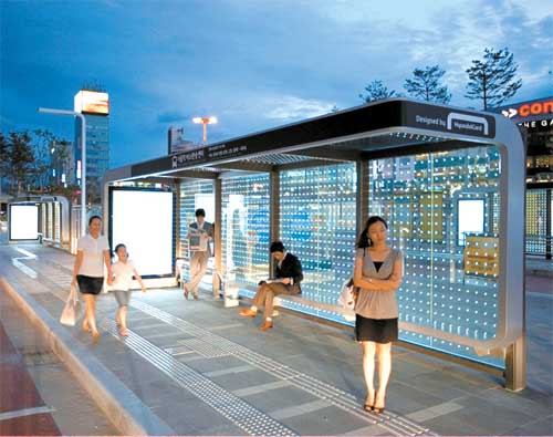
“Art Shelters,” the bus stops in front of Seoul Station, reflects Hyundai Card’s interest and contribution to public art.[JoongAng Ilbo]
The bus stop here recently reopened after weeks of renovation. It features a group of stands - 12, to be exact - that seem way too artistic and stylish to be merely for a bus stop, more suitable in fact as installation art at a trendy gallery.

The Yeouido headquarters of Hyundai Card provides a playful resting area for employees with a recently-installed ride. [JoongAng Ilbo]
It’s certainly a picturesque scene: a historic train station in the background with a futuristic, intelligent timetable flashing in front of you.
Another interesting scene unfolds at the National Assembly Station on the recently opened line No. 9.
The “Gold Line,” as it is called, connects western and eastern Seoul, and carries images of shops and billboards for the area.
Amidst the colorful, attention-hungry billboards, there is one huge, white billboard with nothing on it. Some may think the ad hasn’t been put in yet. Well, they guessed wrong. Because the empty billboard itself is an ad. For what? That’s the mystery, and the art.
A thing for design
When onlookers are done being amazed by the simple yet daring, odd yet delightful designs, they might notice “Hyundai Card” written in the corners of the installations.
The local credit card company is the artist behind these works.
Officials of Hyundai Card are quoted as saying that they want people to consider this as “talent donation.”
Yes, people often use their talents for the good of their communities. Doctors and lawyers work pro-bono for people who cannot afford their services. When large companies with deep pockets engage in such charity work, the impact gets stronger.
But why then would a credit card company pick design capabilities as one of their talents?
Hyundai Card, which along with Hyundai Capital and Hyundai Commercial form a large financial entity, has in fact been known for its innovative and creative designs for some time now. It introduced credits cards with interesting designs like transparent cards, mini-sized cards as well as cards with strikingly bright colors and equally strikingly minimalist designs.
Besides its products, Hyundai Card’s special love for designs is best illustrated at its headquarters in Yeouido, western Seoul. The lobby of the building is as trendy and hip as a hotel foyer. The restaurant downstairs is more like an art gallery.
What’s more amazing is that the company uses the YouandI font, developed by Hyundai Card in 2004. Hyundai was the first company to develop its own font style.
Considering all this, the art shelters and blank billboard show how Hyundai Card’s particular emphasis on designs has expanded from its office buildings into its products and finally into a public space.
Great marketing effects
Hyundai Card’s “thing for design” and its use of public facilities across the city certainly seem to be doing more than just giving people something pretty to look at.
The bus stop in front of Seoul Station is used by hundreds of thousands of people every day. The National Assembly subway station is also one of the most crowded - it is after all adjacent to the capital’s political and financial hub.
That’s a lot of potential viewers so the stands at the bus stop and the billboards at the subway station have to distinguish themselves in order to get people’s attention.
Chung Tae-young, the president and CEO of both Hyundai Card and Hyundai Capital, called them “marketing that’s multifaceted and long term.” The installations, he says, are there to help people - potential consumers - have a positive perception about the company, rather than stimulating the instant urge to buy the company’s products.
Midtown in Japan is a good example of how people or environment-friendly architecture can benefit companies.
The office, residential, commercial, hotel and leisure space in Tokyo has created significant amounts of greenery in the area, allegedly bringing down temperatures by 1 degree Celsius in the summer.
In Seoul, the starry, sparkling bus stations light up the gray, bleak cityscape, and the white, empty billboard gives a much-needed break to city dwellers’ eyes, often tired from pollution of crammed billboards screaming with information.
Officials at Hyundai Card explained, “If we can get people’s attention by emptying, rather than injecting information, we think we’ve succeeded.”
Meanwhile, Hyundai Card’s active support for other various cultural fields like art, sports and the performing arts continues.
It supported the “Destination: Seoul” project featuring Korean artists at the Museum of Modern Art’s Design Store in New York City earlier this year. Also, its “Super Concert” series has been featuring big-name musicians like Billy Joel, Placido Domingo and Craig David.
By Lee Seok-ho [hkim@joongang.co.kr]


with the Korea JoongAng Daily
To write comments, please log in to one of the accounts.
Standards Board Policy (0/250자)