

Typography event showcases artistic value of text
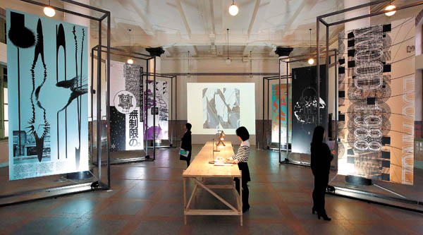
The Fourth International Typography Biennale, or Typojanchi 2015, organized by the Korea Craft and Design Foundation, is ongoing at Culture Station Seoul 284 located next to Seoul Station in central Seoul. Above, visitors take a look at the works of 91 artists from 22 countries exhibited at the venue. [KCDF]
Some people are fed up with seeing too much text all around them. But what if the words on these signs, billboards and flyers could disappear?
An experimental typography group called Dainippon Type Organization shows what cities or products without text look like through its art project “No Future Without ‘ ’.”
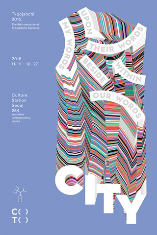
A poster designed by artist and designer Keetra Dean Dixon. [KCDF]
The biennale, organized by the Korea Craft and Design Foundation, aims to demonstrate how texts that people routinely encounter and use in their everyday lives have artistic value, and explore together the possibilities of typography together with artists under the theme “City and Typography,” written as “C ( ) T ( ).”
Kymn Kyung-sun, director of this year’s event and a professor of design at the College of Fine Arts of Seoul National University, said he “wanted to focus especially on how type is used in this unsympathetic and dreary city.”
“The word ‘metro’ from metropolitan city originates from a Greek word that means ‘mother’,” Kymn said.
“For this year’s biennale, eight curators worked together with the theme, and we wanted to erase the vowels that symbolize mother to see how texts operate without all the vowels.”
However, Kymn said they opened up the spaces where the vowels used to exist with parenthesis so the participating artists could fill up the spaces with their own imaginations.
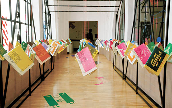
An exhibition by designer Cho Kyu-hyung based in Stockholm displays books hanging from the ceiling to present a more fun and easier way of reading books and walking through to the next exhibition. [KCDF]
With the help from the artists, he captured panoramic views of seven Asian cities including Tokyo, Seoul and Bangkok to allow visitors to distinguish between the cities just by looking at the difference in the characters used on signboards, street signs, billboards and so on.
“When we first visit a city, we read a map and we see the city from a panoramic view. But a city from our point of view is an accumulation of landscapes in 360 degrees,” Goto explained.
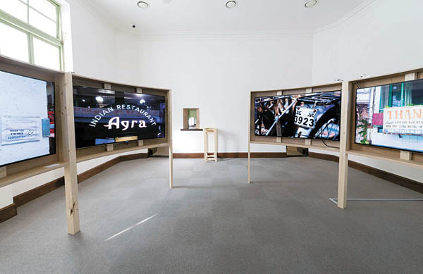
Japanese curator Tetsuya Goto worked with seven other artists based in different cities in Asia to show side-by-side comparisons of the Asian metropolises in “Asia City Text/ure.” [KCDF]
“BOOK BRIKS” is a project by PaTI, or the Paju Typography Institute, which is an alternative design school established by the Paju Typography Educational Corporative in 2013. It is located in Paju Book City in Gyeonggi. The project participants turned hundreds of thousands of books that are thrown away in the city into bricks.
“Paju Book City is where countless words are edited, designed and printed,” said Choi Moon-kyung, a professor at PaTI. “Just as books are quantitatively the biggest product made in Paju Book City, so too are they discarded here more than any other item.”
In an effort to preserve these discarded books in a different form, PaTI saved these books from the bin, removed their covers, soaked the paper in water, and added a few other ingredients before grinding it all up, ultimately making a type of paste that was then turned into bricks.
“These bricks become part of the buildings in Paju Book City,” Choi said. “This is an effort to preserve the memory of a typographic city’s castaway books.”
Among numerous exhibits of designers, director Kymn picked “Seoul ( ) Soul: The Neighborhood Bookstores of the Seoul” as the most approachable exhibition for general visitors without any background in art or design.
“The place where people most personally and directly experience text in the city is the bookstores, but due to the introduction of e-books, online bookstores and large bookstores, many small and old bookstores in the alleys have disappeared,” Kymn explained.
The exhibit introduces about 400 small bookstores around Seoul that have been in business for more than 30 years.
“Visitors will have fun looking for which bookstores are located close to their homes while checking out the list of books that these bookstores recommend on a postcard that visitors can take home,” he added.
More details about the biennale are available at www.typojanchi.org.
BY YIM SEUNG-HYE [yim.seunghye@joongang.co.kr]


with the Korea JoongAng Daily
To write comments, please log in to one of the accounts.
Standards Board Policy (0/250자)