

Pushing typography outside the box: Exhibit explores the life works and achievements of font design pioneer Ahn Sang-soo
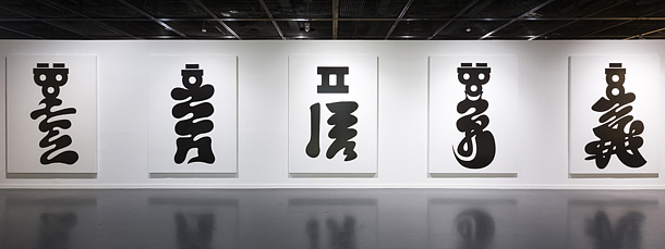
Typographer Ahn Sang-soo is currently holding an exhibition at the Seoul Museum of Art in central Seoul, presenting several new works including “Hollyeora” (2017), above, an acrylic painting on canvas displaying folk-inspired Korean letters. [SEMA]
The exhibition explores a panoramic view of Ahn’s achievements, starting from the beginning of Ahn’s career as a typographer, creating the ahnsangsoo font in 1985, to his latest project - running the Paju Typography Institute (PaTI), a four-year college that was established in 2012 with just two students. This year, 14 students will be graduating from the school. The exhibition is titled “nalgae.pati,” with “nalgae” referring to Ahn’s nom de plume and “pati” referring to the name of Ahn’s new school.
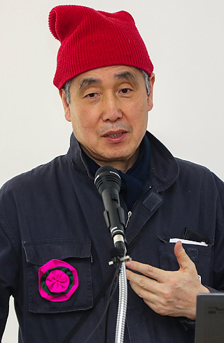
Ahn Sang-soo
“When I approached designer Ahn’s works, the very first word that I couldn’t really digest was ‘typography,’” said Kwon Jin, curator of the exhibition. “But it is the basic concept of Ahn’s works so I tried to layout the exhibit so that even the laymen can understand Ahn’s work and his philosophy.”
The exhibition starts off with introducing the ahnsangsoo font, a typeface that’s familiar to most Koreans. The font was recognized for being the first kind that went outside the box, escaping from the boundary of a square frame that was used for Chinese letters. So far, he has designed four hangul fonts.
“He indeed exploited the graphic flexibility of hangul that used to be locked in the square frame of Chinese letters for a long time,” said Kwon.
The exhibition is divided in two large sections, the “nalgae” section exhibiting Ahn’s creations that can be seen in the form of media art, installation, magazines, and so on. There are several new works as well, including “Hollyeora” (2017), an acrylic paint on canvas displaying a folk painting-like design of letters reading “hollyeora,” a Korean word which means to “be immersed.”
“I believe the basic attitude a creator should have is being immersed in something,” said Ahn.
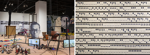
Left: The second part of Ahn’s exhibit presents works produced through his new school PaTI. Right: New work by Ahn titled “Ceramic Tiles” (2017) in which he tried to visualize the sounds of hangul, the Korean alphabet. [SEMA]
The second “pati” section is dedicated to Ahn’s new institution in Paju, Gyeonggi.
According to Ahn, “PaTI is not simply an education institution for the general public, but a design community and an education cooperative for those who dream to become a professional designer.”
“Until I was 40, I dedicated my life as a designer in the field, then the next 20 years, I became an educator teaching students at my alma mater, Hongik University,” said Ahn. “When I turned 60, I wanted to seek change in my life, and design a new kind of education by breaking away from the existing education system.”
Therefore, the school is, according to Ahn, very creative and experimental.
The exhibition explains how the school was established, as well as introducing its original curriculums and works created by its students.
“Rather than simply showing how an educational institution was established, this exhibition will reveal the efforts and philosophies of PaTI participants, aiming for the realization of an ideal community with a focus on the education that is required in our current time,” said curator Kwon.
“This year begins major exhibitions in preparation for the 100th anniversary celebrations of Bauhaus, which started off as a German art school,” said Ahn. “We, at PaTI hope to follow its system and carry out various experiments designing new kinds of design education.”
To allow visitors to learn more about PaTI, there’s a “temporary classroom” within the exhibit, where workshops and participating programs will be held, including carrying out a number of PaTI classes with participants, typeface designing, as well as talks by PaTI teachers and alumni.
BY YIM SEUNG-HYE [sharon@joongang.co.kr]
The exhibition, which kicked off on March 14, will run through to May 14 at the Seoul Museum of Art in central Seoul. Admission is free. The museum opens between 10 a.m. to 8 p.m. on weekdays and until 7 p.m. on weekends and public holidays. It is closed on Mondays.


with the Korea JoongAng Daily
To write comments, please log in to one of the accounts.
Standards Board Policy (0/250자)