

2018 gets provocative with pops of purple : Pantone’s Color of the Year, Ultra Violet, invites individuals to challenge conventions, get creative and make their mark
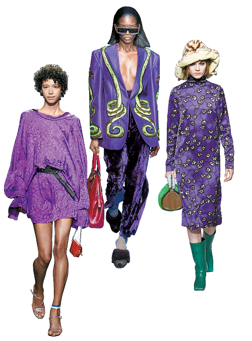
Models wear outfits designed in different hues of purple and violet. From left are models from the 2018 Spring/Summer collection from Zadig&Voltaire, the 2018 Spring/Summer collection from Gucci and the 2017 Fall/Winter collection from Marni. [ZADIG&VOLTAIRE, GUCCI, MARNI]
Pantone gained authority in the field of design in 1963, when it first came up with the universal color language system featuring over 4,000 colors, allowing the whole world to come to a common understanding on which colors were which. Since 2000, it has named its “Color of the Year,” which the company speculates as the color that will reflect the upcoming year’s lifestyle trends. On Dec. 7, it selected Ultra Violet (Pantone 18-3838) as the color for 2018, a vivid and “provocative” purple hue, as explained by the company.
The color of the year, according to Pantone, doesn’t just set the trend, but also tries to reflect the moment in time. Thus, Ultra Violet is more than just a trendy color, but also “symbolic of counterculture, unconventionality, and artistic brilliance,” according to the company. Greenery (Pantone 15-0343), the company’s 2017 pick, was chosen to symbolize a new beginning with the inauguration of President Donald Trump, and in 2016, it chose two colors for the first time - Rose Quartz and Serenity (Pantone 13-1520 and Pantone 15-3919) - to visualize a blurring of the genders.
In this context, the violet vibe points to a new direction amidst a vague future. “Nuanced and full of emotion, the depth of Ultra Violet symbolizes experimentation and non-conformity, spurring individuals to imagine their unique mark on the world, and push boundaries through creative outlets,” wrote Leatrice Eiseman, executive director of the Pantone Color Institute, describing the reasons for choosing Ultra Violet as the color of this year. She added, “Musical icons Prince, David Bowie, and Jimi Hendrix brought shades of Ultra Violet to the forefront of Western pop culture as personal expressions of individuality.”
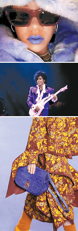
From top: U.S. singer Rihanna posted a photo of herself wearing a violet lipstick from her own cosmetics brand after Pantone released the 2018 Color of the Year on Dec. 7; Music icon Prince was known for expressing himself with violet outfits; A bag from Mulberry’s 2017 Fall/Winter collection look-book. [INSTAGRAM, JOONGANG ILBO]
Yet, just as things are easier said than done, the reaction from the fashion industry hasn’t exactly been the warm welcome Pantone was hoping for. Rather, the general idea is that the color is too “difficult,” as a wide array of meanings all coexist within the single color, from royalty, to sensitivity, to artistic genius and mental disorders. Violet isn’t a shade that conveniently fits into a box.
“Some people think of a witch when they see the color purple, but theoretically, it’s a color that people with high self-esteem choose when they want to be recognized by others,” said Kim Min-kyung, president of the KMK Color Institute in Korea.
After all, most people are not used to incorporating violet into their lives. It’s a very uncommon color to be used in interiors, makeup or in everyday outfits - even more so in Korea, where people tend to prefer achromatic colors such as white, grey or black in the things they buy and wear. Greenery was too bright for many and failed to catch on in the same sense.
“Our eyes are used to basic colors like red, blue and green even when they’re used to make a special point [in an outfit], and our eyes are unfamiliar with purple,” said Choi Ji-hyung, designer of the local fashion brand “Johnny Hates Jazz.”
As difficult as it is, some are willing to take on the challenge to up their game. “If it’s a difficult color, then it’s worth a try,” said designer Rejina Pyo, as it allows you to express yourself differently from others.
“[The color of the year] is a chance to take a look at colors that have been out of range up to now,” said the president of Trend Lab 506, Lee Chung-min.
Proving that the experts weren’t saying so in vain, there are several cases in which people have made violet their own, especially celebrities. U.S. singer Rihanna recently posted a picture of herself wearing violet lipstick from her own cosmetics brand soon after Pantone’s announcement in December.
For fashionistas looking for tips on how to hop on the trend, the best places to look to are fashion shows. The 2018 Spring/Summer collection from Gucci and 2017 Fall/Winter collection from Marni both paired violet with green.
“In theory, pairs of colors that are on the opposite sides of the color wheel go well together,” said stylist Suh Soo-kyoung. “If you choose [green] colors with a lower chroma, like olive or khaki, then you can worry less about standing out too much.”
Designer Pyo recommends what’s called “tone-on-tone,” where you match similar colors of different intensities or brightness together. “But best of all, get creative and coordinate in your own way,” said Pyo.
BY LEE DO-EUN [yoon.soyeon@joongang.co.kr]
[라이프 스타일] 새해엔 보라 옷 한번 입어봐?
어김없이 돌아왔다. 바로 ‘올해의 컬러’ 발표다. 색채전문기관·페인트업체 등에서는 저마다 내년을 전망하는 트렌드 컬러를 내놓는다. 영국의 컬러마케팅그룹(CMG)과 독일 화학기업 메르크(Merck) 등이 있지만 그중에서도 가장 대중적으로 알려진 건 미국 색채전문기업 팬톤(Panton)이다. 4000여 개의 고유색을 개발하며 ‘색채의 권력’으로 불리는 팬톤은 2000년 이후 매년 라이프스타일 전반에 유행할 색상을 제시해오고 있다. 그리고 12월 7일 2018년의 컬러로 울트라 바이올렛(Pantone 18-3838)을 발표했다. 이름만큼이나 쨍하고 선명한 보라색이다.
올해의 컬러는 단순한 트렌드 제시 그 이상의 ‘시대 정신’을 반영한다. 팬톤은 2016년에는 연둣빛의 ‘그리너리’, 2015년에는 분홍·하늘빛 두 가지의 로즈 쿼츠와 세레니티를 ‘올해의 색’으로 결정한 바 있다. 전자는 도널드 트럼프 대통령의 취임과 맞물리며 새로운 시작을, 후자는 남성과 여성의 구분이 모호해지는 사회 분위기를 반영한 선택이었다.
이런 맥락에서 보라색은 불투명한 미래를 진취적으로 헤쳐가자는 방향성을 제시한 것이라 할 만하다. 리아트리스 아이즈먼 팬톤 색채연구소장은 공식 성명에서 “독창성과 상상력이 필요한 세상을 사는 지금 울트라 바이올렛의 창의적 영감이 우리 의식과 잠재력을 다른 차원으로 끌어 올릴 것”이라고 선정 배경을 밝혔다. 또 “프린스와 데이비드 보위, 지미 헨드릭스 등 전설적인 가수들이 즐겨 쓰던 색”이라고 덧붙였다.
로리 프레스맨 팬톤 부사장 역시 색깔과 시대의 조우에 더 힘을 실었다. 그는 “팬톤의 올해의 컬러는 현재 세상이 무엇을 원하는가를 반영한다”며 “디자이너나 브랜드들이 이 컬러를 통해 아이디어를 얻고, 또 내포된 메시지를 전달할 수 있을 것”이라고 의미를 설명했다.
하지만 이론과 실제가 다르듯, 보라색에 대한 패션계의 반응은 한마디로 ‘어렵다’로 모아진다. 색깔 하나를 두고 귀족적, 극도의 예민함, 예술적 감성, 정신적 혼돈 등 넓은 스펙트럼으로 표현되는 탓이다. 귀여운 노랑, 미래주의적 실버라는 식으로 명쾌하게 단언하기 쉽지 않다. 김민경 한국케엠케색채연구소장은 “보라색을 보고 마녀의 이미지를 떠올리는 사람도 있지만 이론적으로는 남이 나를 알아봐주기 바라는 자존감 높은 사람이 택하는 컬러”라고 말했다.
무엇보다 보라색은 우리 눈에 익숙지 않다. 실제로 인테리어는 물론 화장·옷에서도 보라색은 흔히 볼 수 없는 색깔이다. 유럽에 비해 라이프스타일 자체가 흰색·검정·회색 등 무채색이 압도적인 국내에선 더욱 그렇다. 여성복 브랜드 ‘쟈니헤잇재즈’의 최지형 디자이너는 “포인트 컬러라 해도 레드·블루·그린 등 기본 원색에 눈이 길들여져 있어 보라가 더욱 낯설다”고 말했다. 2016년 형광빛이 도는 연두색 ‘그리너리’가 거의 주목받지 못한 이유와 비슷하다. 해외 반응도 마찬가지다. 파이낸셜타임스는 “맥락 없는 결정”이라며 “차라리 아이폰X의 컬러를 올해의 컬러로 하는 게 낫겠다”고 날카롭게 비판했다.
하지만 런던 디자이너 브랜드 ‘레지나 표’ 표지영 디자이너는 “어려운 컬러라면 오히려 그만큼 도전할 만하다”고 말한다. 색 하나로 자신의 취향을 드러내고 남과 차별화할 수 있기 때문이다. 트렌드분석업체 ‘트렌드랩506’ 이정민 대표 역시 “올해의 컬러는 소비자에게 ‘이런 색도 있어’라는 일종의 가이드라인”이라며 “지금껏 선택 영역 밖에 있던 컬러에 눈길을 주는 기회”라고 설명했다.
이미 난이도 높은 보라색을 보란듯이 소화한 사례도 있다. 첫 주인공은 영국 엘리자베스 2세 여왕이다. 팬톤이 2018년의 색을 발표한 당일 여왕은 포츠머스 해군 행사에 참여하며 보라색 모자와 코트를 빼입어 화제가 됐다. 늘 컬러풀한 옷을 즐겨 입었지만 이날만큼은 ‘왕실 패셔니스타’의 면모를 고스란히 보여줬다. 미국 팝가수 리한나도 재빠르게 동참했다. 그는 자신의 화장품 브랜드에서 만든 보라색 립스틱을 짙게 바르고 보라색 외투를 걸친 사진을 인스타그램에 올렸다.
이들처럼 평소 과감한 패션을 소화해온 패셔니스타가 아니라면 보라색을 소화할 방법은 뭘까. 보라색을 선보인 주요 패션 컬렉션을 참고해볼 만하다. 2018년 봄·여름 구찌 무대나 2017년 가을·겨울 마르니 패션쇼에서는 보라와 초록색을 공통적으로 짝지었다. 서수경 스타일리스트는 “색상표에서 서로 마주 보는 컬러끼리 궁합이 맞는 원리”라며 “올리브·카키색처럼 채도가 낮은 컬러를 고르면 튄다는 부담을 줄일 수 있다”고 말했다. 또 클래식하게 보이려면 검정·회색 등 무채색을, 세련되고 젊은 느낌을 주고 싶을 땐 밝은 브라운색을 택하면 된다.
표 디자이너는 비슷한 컬러를 짝짓는 톤온톤을 추천했다. 이미 2017년 하반기부터 거의 모든 컬렉션에 등장한 트렌드이기 때문에 채도와 명도를 달리해 와인·라일락 등으로 스타일링해도 신선하다는 것. “무엇보다 자신만의 컬러 조합을 만들어 보는 상상력을 발휘해 보라”는 게 그의 조언이다.
이도은 기자


with the Korea JoongAng Daily
To write comments, please log in to one of the accounts.
Standards Board Policy (0/250자)