

Handbag designer makes her mark with vintage-style pieces: Koo Ji-hye’s bold bag brand gu_de has been chosen to be part of Net-a-Porter’s The Vanguard project
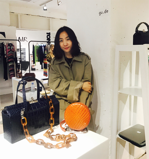
Designer Koo Ji-hye poses with her handbags. [GU_DE]
On Sept. 7, four lucky winners were revealed to be part of The Vanguard. Out of the four was Korean designer Koo Ji-hye. In 2016, she launched her own handbag brand called gu_de. The brand, which is not well known domestically, has now received international acclaim. What makes the brand stand out amongst the rest? On Sept. 17, JoongAng Sunday, an affiliate of the Korea JoongAng Daily, sat with Koo to talk about her designs.
“There are quite a few people who enthusiastically searched for my bag before finally getting their hands on one,” said designer Koo during the interview. Koo admitted that she wasn’t expecting many people to check out her designs early on when she had a booth in the corner of a lower floor at a major fashion event. “Whenever someone comes to me introducing themselves as a buyer, I’m instantly in shock because, most of the time, they represent international department stores or multishops.”
Koo was also quite moved when an overseas fashion influencer bought one of her bags. Some customers even take pictures of her handbags because they were impressed with the design. Koo says that the name gu_de may also be one of the reasons for her success. “Gu_de means good in Scottish. I think, since we are based in London, many London-based buyers are friendlier and treat us hospitably [because they are familiar with the name,]” said Koo.
Once chosen for The Vanguard project, brands have shown to perform drastically better than before. Nowadays, Koo admits to receiving at least a dozen business enquiries through e-mail, all asking for her brand to be sold in their department stores. The buyers that represent these brands come from Italy, the United States and China. Her brand has even been featured in international fashion magazines like Vogue and InStyle. “[Our brand] is going upwards at a scary pace,” Koo commented.
Koo also says that she could have never expected to be where she is after just two years. In 2015, she was working for a well-known international handbag and accessory label when she quit her job due to health complications. While traveling to the United States and Europe, she found herself becoming more interested in vintage products, especially the items made in the 1970s. One design that stood out in particular was the old leather rectangular bag that doctors would carry at the time, which were neither too masculine nor feminine. “I wanted to create a handbag that had a classic design and also a young flair to it,” said Koo.
Koo often uses Italian leather from cows, but stamps the leather to make it look like crocodile. She shies away from using only black and opts for vibrant colors like red and ivory. She often includes distorted metal handles or attaches wooden clamps to the corners of the handbag to add angles. The designs adds a light and vibrant air to her products.
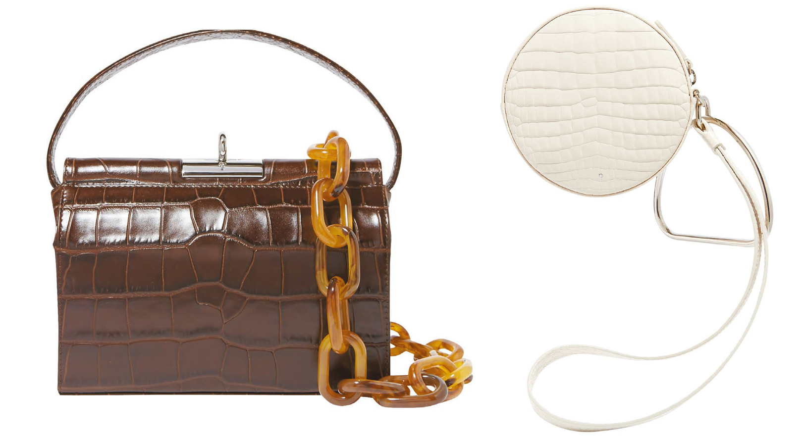
The milk bag, left, is based off an old fashioned surgeon’s bag. The circular white bag, right, has been pressed to look like crocodile. [GU_DE]
Koo first started out in a small workshop with her heart set out on designing custom handbags. However, the situation started to turn after she posted her bags on Instagram. After seeing her bags online, Korean design stores like Beaker and W Concept started to offer her brand some space in their stores.
Koo got on Net-a-Porter in a similar manner. The fashion director of the site, Lisa Aiken, said she first discovered gu_de on Instagram. “I was able to squeeze in a meeting with Lisa, who came into Korea for Seoul Fashion Week, just hours before her flight back to London. That was when she told me how amazing it was that I was able to offer high-quality bags at such a reasonable price range,” said Koo.
Gu_de’s handbags are made with meticulous care given to every small detail. Koo’s handbags have straps that are a chain that she insists on submerging in hot water before it is attached to the hand bag to make sure that each link is smoothly connected with each other. “Many Korean [buyers] expected that I was eventually going to have to raise the price of my handbags or give up on quality. However, international buyers thought differently,” Koo said. The “milk bag” is sold at a higher price internationally than nationally, but the bag is still steadily in demand.
The fact that gu_de is receiving such acclaim is good news for Koo. The craftsmen in the factories who worked on these bags are full of pride for having worked on products that have received international acclaim. She has even heard that the factory is being rearranged to prioritize the needs of her brand. Koo concedes that many Chinese factories that offered to work with her brand, but she turned them all down because she wanted to make sure that her products were made in Korea.
It is still unknown what designer Koo has up her sleeves, but many expect her to move forward with her success. When asked what she has in store next, Koo instead explained the importance of moderation. “I completely agree with Lisa’s advice about how it was important not to try too many different designs. Celine and Balenciaga handbag designs are all quite tempting and beautiful, but I feel as if my voice will be lost if I start trying out those kinds of designs. Instead of adding [designs], I feel as if I should try to subtract [designs] this time,” said Koo.
BY LEE DO-EUN [jeong.juwon@joongang.co.kr]
“비슷해질까봐 해외 컬렉션 일부러 안 봐”
최근 세계 최대 글로벌 쇼핑 사이트인 네타포르테(www.net-a-porter.com)가 전세계 신진 디자이너들을 발굴하고 육성하는 프로젝트 ‘더 뱅가드(THE VANGUARD)’를 시작했다. 과거 ‘백화점에 들어갔다’는 말이 신생 브랜드의 보증 수표가 된 것처럼, 이 프로젝트에 선발되면 ‘네타포르테가 점찍었다’는 사실만으로도 후광을 누릴 법하다. 판매•홍보 및 멘토링 등 전방위 지원을 해주기 때문이다.
7일 프로그램 발표와 동시에 첫 행운의 주인공 4팀이 발표됐다. 반갑게도 한국 디자이너 브랜드의 이름이 보였다. 구지혜(38) 디자이너가 2016년 론칭한 핸드백 브랜드 ‘구드(gu_de)’다. 국내에서조차 거의 알려지지 않은 브랜드가 오히려 글로벌 시장에서 먼저 주목받은 셈인데, 그 특별함은 과연 무엇일까. 17일(현지시간) 런던 패션위크 쇼룸에 참가한 그를 중앙SUNDAY S매거진이 만났다.
스코틀랜드어로 ‘굿’ 뜻하는 구드
“일부러 물어물어 찾아오는 분들이 꽤 많아요.” 구씨의 목소리가 상기된 표정과 함께 한 톤 높게 들렸다. 메인 패션쇼장 건물의 한 층 아래, 게다가 거의 구석에 자리한 부스임에도 예상보다 훨씬 많은 손님이 찾아오는 게 신기하기만 하단다. “누가 쓱 와서 ‘난 어디 어디 바이어다’ 할 때마다 깜짝 놀라요. 패션계 큰 손이라는 해외 백화점•편집숍 담당들이거든요.”
해외 패션 인플루언서가 직접 구매한 구드 백을 메고 온 모습에는 감격스럽기까지 했다고 했다. 그와 대화하는 중에도 제품 사진을 찍어가는 방문객들이 종종 눈에 띄었다. 게다가 이번에는 이름 덕까지 봤다. “구드는 ‘좋은(good)’을 뜻하는 스코틀랜드어에요. 아무래도 런던이다보니 영국 바이어들이 더 관심을 갖고 호의를 보였죠.”
‘뱅가드’에 뽑히면서 브랜드의 상황은 ‘비포 앤 애프터’가 확실하다. 요새는 하루 열 통씩 이메일로 입점 문의가 들어오는데다, 대상 국가도 이탈리아•미국•중국 등 제각각이다. 보그•인스타일 같은 세계적 패션잡지 사이트에 소개 기사가 실린다. 그의 말마따나 “무서울 정도”의 수직상승 곡선을 그리고 있다.
정작 그는 론칭 2년 만에 여기까지 올 줄은 전혀 몰랐다고 말한다. 구호•르베이지 등 국내 대표 브랜드의 가방•액세서리 디자이너로 일했던 2015년, 건강이 나빠지면서 일을 관뒀다. 자유로운 몸으로 미국•유럽을 돌자 그의 눈에 들어온 건 빈티지 제품이었다. 특히 1970년대 빈티지 스타일이 시선을 붙들었다. 의사들의 왕진 가방 같은 닥터백이 그랬다. 너무 여성스럽지도 남성스럽지도 않은 디자인의 변주, 거기에 고전적 실루엣을 지닌 것이 매력적이었다. “클래식한 형태지만 젊은 감각을 갖춘 핸드백을 만들어보겠다”는 아이디어가 머리 속을 채웠다.
이탈리아산 소가죽에 악어 가죽처럼 보일 스탬프를 찍었다. 또 검정 일색을 벗어나 빨강•아이보리 색으로 발랄한 이미지를 꾀했다. 자그마한 원형 손가방에 비정형 금속 손잡이를 단다거나, 핸드백 여밈 부분을 나무 틀로 짜서 각진 모양을 잡아주면서도 경쾌한 느낌을 주었다. “해외 컬렉션은 일부러 보지 않았어요. 회사에서 일할 때도 참고를 하다보면 늘 비슷해지기 일쑤였으니까요. 나만의 디자인을 만들고 싶었어요.” 이름도 직관적이면서 스토리텔링이 가능한 모델명을 만들었다. 옆모양이 마치 우유갑 같다고 해서 ‘밀크백’, 샘플 품평회에서 운좋게 살아남았다 하여 ‘럭키백’으로 붙이는 식이다.
속도내기보다 절제 스타일 고수할 터
처음엔 알아봐주는 사람에게만 공급하는 주문제작형 시스템을 염두에 두고 공방처럼 작은 사무실을 얻었다. 한데 상황이 다르게 돌아갔다. 인스타그램에 올린 제품을 보고 얼마 안 돼 비이커•W컨셉트 등 국내 대표 온오프 편집숍에서 입점요청 연락이 온 것.
올해 4월 네타 포르테에 들어간 것도 비슷했다. 그 곳의 패션 디렉터인 리사 에이킨이 지난해 인스타그램을 보다 ‘구드’를 발견했다. “서울패션위크를 보러 왔던 리사가 런던으로 출국하기 몇 시간 전에 극적으로 만나 미팅을 했어요. 그때 그러더라고요. 이 정도 품질을 이 정도 가격대(20만~60만원)로 만든다니 대단하고요.”
‘이 정도 품질’은 어찌보면 사소한 한 끗 차이다. 가령 체인이 연결된 핸드백 스트랩을 만들 때, 체인 이음새를 매끈하게 만드는 것이다. 체인 하나하나를 뜨거운 물에 잠깐 담궜다 빼면서 경계를 없애는 작업을 고집하기 때문이다. “오히려 국내에서는 너무 비싸다, 오래 못 버티고 품질을 낮출 거다, 라고들 했는데, 세계 시장을 읽는 바이어 눈에는 달랐던 거죠.” 실제 지난 시즌 인기를 끈 밀키백의 경우, 국내보다 해외에서 20만원 더 비싸게 팔고 있지만, 매출 그래프는 계속 올라가고 있다.
‘구드’가 주목 받으면서 뿌듯한 일도 있다. 함께 손잡고 일하는 공장 장인들의 자부심이 한껏 높아졌다는 것. 처음에는 깐깐한 요구에 손사래를 치던 이들도 구드가 해외에까지 팔린다는 소식에 “한국 손맛을 보여주자”면서 아예 공장 세팅 자체를 구드 중심으로 바꿨단다. 이름이 알려지면서 중국 공장들의 러브콜이 있지만, 이런 이유로 그는 ‘메이드 인 코리아’를 고집하기로 했다.
이제 막 속도를 내고 달려나가야 할 지금, 그는 어떤 구상을 하고 있을까. 여러가지를 시도해 볼 법도 한데 그는 오히려 ‘절제’를 이야기했다. “너무 많은 디자인을 하지 말라는 리사의 조언에 전적으로 공감해요. 셀린느 스타일도 좋고, 발렌시아가 스타일도 예뻐 보이고 . 근데 그걸 다 욕심내다 보면 정작 내 색깔은 어디에도 없을 거잖아요. 지금이 바로 덧셈보다 뺄셈이 필요한 때죠.”
이도은 기자


with the Korea JoongAng Daily
To write comments, please log in to one of the accounts.
Standards Board Policy (0/250자)