

Karel Martens’s world of vast possibilities: From ink and metal, graphic designer embraces technology
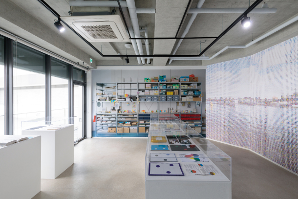
“Karel Martens Studio Wall” (2018) features a picture of graphic designer Karel Martens’ studio from the inside, and the scenery outside the studio. [PLATFORM-L]
This is the first work on display at the “Karel Martens: Still Moving” exhibition at Platform-L, a contemporary art center located in southern Seoul, which will run through Jan. 20. The multi-media work titled “Icon Viewer” (2015) welcomes visitors along with “Colors on the Beach” (2018), which is a colorfully painted beach cabin. Together, the two works embody the essence of Martens’s works: movement and color.
Graphic design wasn’t very prominent when Martens started his education. “I grew up with the ink and the metal,” Martens told the local press. “The recent development in technology has created more possibilities, and the world of design has changed. With computers, there is so much more we can do. The computer is unlimited.”
In his first ever Korean solo exhibition, Martens demonstrates how he has shaped the graphic design field from the 1960s, experimenting with developing technologies. He began with the traditional printing medium - ink on paper - with different publishers or working on commissioned works. He was widely recognized for designing the Dutch architecture magazine series “Oase” from 1990, 72 copies of which are on display in the earlier part of the exhibit. He received numerous prizes such as the H.N. Werkman Prize in 1993 and the Dr A.H. Heineken Prize for Art for his contribution to Oase.
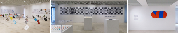
From left: 72 copies of the Dutch architecture magazine “Oase” are on display, a magazine that Martens worked with since 1990 and which got him recognition in the design world; “Time Difference Between Amsterdam and Seoul” (2018) is a visual representation of time shown through the movement of patterns; “Three Times” features three circles that each move along to the time - hours, minutes and seconds. [PLATFORM-L, YOON SO-YEON]
“Time Difference” is a revised version of an earlier work he showed in Japan in 2013, which was called “Time Difference Between Amsterdam and Tokyo.” The work that plays with optical illusions using the idea of time. The patterns change shape every second, just as the work “Three Times” does on the wall next to it. Circles painted in blue and red, the colors of the Korean flag, move at different speeds, just as the hands of a clock move. The infinite number of color alignments that are created symbolize the infinite number of possibilities and choices a designer must make, according to Martens.
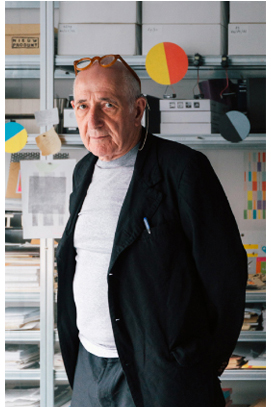
Karel Martens, a 79-year-old graphic designer, visited Seoul for the exhibition. [PLATFORM-L]
“Karel Martens Studio Wall” (2018) is a representation of the myriad of choices laid out before a designer. As with “Icon Viewer,” the image seems to be the colorful scenery of Amsterdam that he can see from his studio, but up close, the viewers see a concerto of different icons. A photograph of the designer’s studio covers the whole left side of the wall next to “Karel Martens Studio Wall,” and it’s as if the visitors are actually inside Martens’s workshop. They also experience the scenery that inspired Martens.
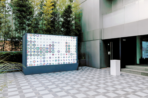
“Icon Viewer” (2015) by Karel Martens and Diederik Martens sits in the yard of Platform-L, welcoming visitors as the first work on display. [PLATFORM-L]
“It’s not about what’s good and not good. Always think about what makes you curious, and what interests you. To discover who you are, the longer you have to spend time being faithful to yourself.”
BY YOON SO-YEON [yoon.soyeon@joongang.co.kr]


with the Korea JoongAng Daily
To write comments, please log in to one of the accounts.
Standards Board Policy (0/250자)