

Icon of motherhood, or art for art’s sake?
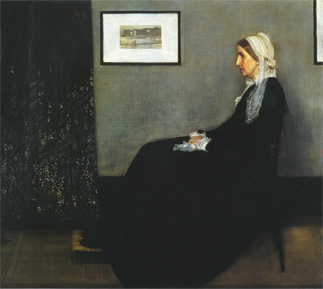
“Arrangement in Gray and Black” — Portrait of the Artist’s Mother (1871) Whistler. Oil on canvas, 144.3 x 162.5 centimeters, Muse d’Orsay,
The painting, commonly known as “Whistler’s Mother,” is such an icon of motherhood that it was used in a 1934 stamp, which is said to be the U.S. Postal Service’s first stamp for Mother’s Day.
The original painting depicts an elderly woman in a clean, simple black dress and white lace cap sitting calmly in a clean, simple room dominated by gray and black.
The neat interior of the room, the woman’s dress, her pose and especially the position of her hands clasped together decently suggest something about the woman’s past, perhaps focused on setting up a home and raising children. The quiet grays and blacks and the woman’s withered face and hands suggest something about her present.
The serenity of the painting evokes the feelings of love and sympathy people may have for their aging mothers better than paintings filled with sentimentalism. Perhaps that is why the painting has become such an icon of motherhood for so many Western people, especially Americans, who have referred to or parodied it numerous times in commercial advertisements, films and elsewhere.
In the 1997 British comedy, “Bean,” the painting is just as important as Mr. Bean, the movie’s main character. The film is about the fuss made after Bean, an incompetent museum official, wipes out the face of Whistler’s Mother by mistake.
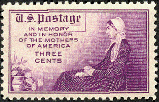
A 1934 stamp issued by the U.S. Postal Service.
The painting’s original title is very dry and abstract: “Arrangement in Gray and Black.” In fact, most of Whistler’s paintings are titled in such a way.
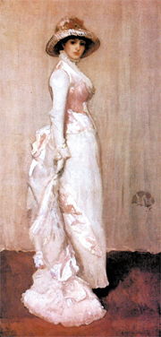
Another painting in which a woman with big, dark eyes stands in a pink vest and a hat, as if she is about to go out, is not titled “Going out” but rather “Harmony in Pink and Grey.” The model’s name is only part of the painting’s subtitle.
Why did Whistler title his paintings in that way? His intention was to get viewers to feel the beauty and harmony of the colors and tones, not to read into the paintings.
Whistler was opposed to art being used as a tool to deliver certain emotions or ideologies. In his book, “The Gentle Art of Making Enemies (1890),” Whistler said, “Art should be independent of all claptrap - should stand alone, and appeal to the artistic sense of eye and ear, without confounding this with emotions entirely foreign to it, as devotion, pity, love, patriotism and the like.”
But if stories, emotions and thoughts are removed, what of the painting remains? According to Whistler, it is aesthetic pleasure, from the colors, tones, forms, materials and compositions of the paintings.
So it is no surprise that the works of Whistler, who pursued his brand of art for art’s sake, are regarded as the precursors to abstract art.
People who are not familiar with abstract art frequently make the mistake of asking questions like, “What does this painting mean?” or “What story does this painting tell us?” when they see an abstract painting composed of colors and lines and nothing else.
Whistler might have said something like:
“This has no meaning. Don’t try to find the meaning in this painting. Just look at it and try to see whether its colors, forms and materials appeal to your eyes. That’s all!
“When you listen to Symphony No. 39 by Wolfgang Amadeus Mozart, do you question what the music means or what story the music tells? You must not. You just feel the aesthetics of the music’s melodies, tunes, rhythm and chords. Look at paintings in the same way!”
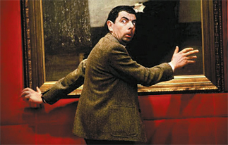
Mr. Bean takes down “Whistler’s Mother” idspn the 1997 British comedy“Bean.”
The titles Whistler gave to his paintings sound musical - “Symphony,” “Harmony” and “Nocturne.” He thought that paintings had to be like abstract music. The word “arrangement” from Arrangement in Gray and Black is also used as musical term, referring to a change in a piece of music.
Given that Whistler opposed the idea of “emotions entirely foreign to it [art], as devotion, pity, love, patriotism, and the like” being added to it, it is somewhat ironic that the image of Arrangement in Gray and Black appeared on the 1934 stamp along with the slogan, “In Memory and In Honor of the Mothers of America.” What would he have said if he had been around back then?
The stamp has no arrangement in gray and black, which was so important to Whistler that he made it the title of the painting, and also includes a bundle of carnations in a vase, which was not part of the original painting. If Whistler had seen this, he surely would have boiled with fury.
Distorting a painting to such a degree does not seem right.
Arrangement in Gray and Black — Portrait of the Artists Mother (1871) Whistler. Oil on canvas, 144.3 x 162.5 centimeters, Muse d Orsay,Paris.
Sometimes, even abstract classical symphonies reflect the composer’s emotions.
Even if the artist succeeded in separating his emotions from his painting, many viewers cannot help but bringing their own emotions into any painting as they look at it.
Although Whistler titled the portrait of his mother, Arrangement in Gray and Black, many people have called and will continue to call the painting Whistler’s Mother. This shows that it is not easy to completely separate art from emotions.
By Moon So-young [symoon@joongang.co.kr]


with the Korea JoongAng Daily
To write comments, please log in to one of the accounts.
Standards Board Policy (0/250자)