

Calligrapher makes his mark on product design
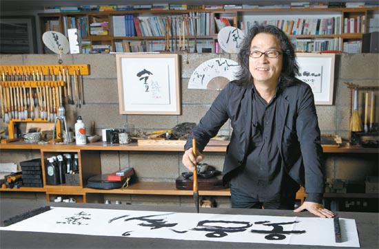
Calligrapher Kang Byung-in works at his Sooltong Calligraphy Institute in Mapo District, northwestern Seoul, earlier this month. By Park Sang-moon
The next time you crack open a bottle of soju or turn on your favorite Korean drama, take a look at the logo. Chances are it’s printed in calligraphic type.
The man behind some of the country’s most recognizable calligraphy designs is Kang Byung-in, a renowned calligrapher who has created unique designs for a wide range of products, from soju maker Jinro’s Chamisul to the titles for TV dramas including “King Sejong” (KBS, 2008) and the ongoing SBS drama “A Thousand Day’s Promise.” He also created the font Bom Nal, or Spring Day, in 2007, which is his third font so far. His aim is to eventually make 10.
Kang has long believed in the selling power of calligraphy.
“A hand-lettered logo does more than just deliver information about a product,” Kang said. “It carries a personal story and message to draw consumers and encourage them to make a purchase.”
In addition to his commercial work, Kang recently presented a collection of his works in the exhibition “Hangul Se-um [Standing] Project” earlier this month. He is also part of the Culture and Arts Honorary Teacher Program by the Ministry of Culture, Sports and Tourism, whose mission is to promote the beauty of Hangul, the Korean alphabet.
Kang is also an avid volunteer who seeks to pass his skills on to others. Since last year, he has taught calligraphy to people with physical and mental disabilities. Today, he will give a lecture to children at a youth detention center in Busan.
Earlier this month, the Korea JoongAng Daily met with Kang at his Sooltong Calligraphy Institute in Mapo District, northwestern Seoul. The following are excerpts from the interview:
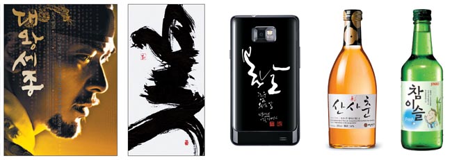
Kang Byung-in’s calligraphy has been used in many different products including, from left, drama posters, such as this one for “King Sejong” (2008), to wall hangings, smartphone cases and liquor labels. Provided by Sooltong Calligraphy Institute
Q. You are recognized as one of Korea’s most famous calligraphers. How did you get your start?
A. Well, at first, I did it to get some sweets. At my elementary school, anyone who took calligraphy as an extracurricular activity got to eat a lot of honey after class because the teacher’s family owned a bee farm. But after I studied the works of Chusa Kim Jeong-hee (1786-1856) in middle school, I started dreaming about becoming a calligrapher. In my second year of middle school, I gave myself the penname Youngmuk. [Youngmuk means “ink forever.”] Later, I realized that Hangul [the Korean alphabet] could be used in design and typography. No one in Korea was doing it professionally at the time, so I decided to work toward developing it into an art.
Your work is focused more on Hangul than Hanja (Chinese characters). Why did you choose to focus on Hangul?
First of all, I want to show the beauty of Hangul. Hangul is a combination of cheon, ji, in. [Cheon means sky, ji means earth and in means human beings.] The shape of the alphabet combines the harmony of nature and human beings. Also, Hangul consists of basic shapes such as triangles, squares and circles. This makes it look like both text and image at once. For example, when writing “chum [춤],” or “dance,” in Hangul, the first consonant “ㅊ” looks like a person who is stretching both arms to the side and hopping up and down on two legs. The shape of Hangul is very artistic, so it has the potential to translate into design. But to make Hangul more appealing, experts from different fields need to work together.
Your calligraphy can be found on many items, including liquor labels, festival signs and drama and movie posters. It even appears on cellphone cases.
Well, for now it is only available on cases for Samsung’s Galaxy S II, but I want to design a case for the iPhone 5 when it comes out next year.
What has been your most challenging project so far?
Designing the titles for “King Sejong.” Sejong wasn’t just a king. He was accomplished in many different fields. He advanced scientific development and encouraged consensus for better governance. On top of everything, he was the one who created Hangul, who gave the general public a chance to read and write. Since the drama was about the life and work of this great king, I felt a great deal of pressure to express all of that in a single piece. I agonized about how to show Sejong’s strong but soft characteristics in my calligraphy.
The production company must also have pressured you. What do you consider “good” calligraphy?
Sometimes people ask me to show them ideas for their products within a few days, but they need to think about it differently. Take soy sauce making, for example. It takes decades or centuries to produce perfect soy sauce, from picking the right beans to waiting until they are fully fermented. Calligraphy is the same. It takes time to create a logo, to capture the essence of a product. If you think about it, the label and the name are the first things customers see before they buy a product. I believe that one good piece of calligraphy can perform as well as a thousand advertising professionals.
Your exhibition, “Hangul Se-um [Standing] Project” was this month. In it, you transformed your two-dimensional paper designs into three-dimensional steel statues. What inspired you?
I’ve always wanted to create a Hangul structure to represent Korea. Like the Eiffel Tower in Paris or the Statue of Liberty in New York, Gyeongbok Palace could represent Korea, but because it’s a royal palace, it doesn’t have a generic meaning. I think we need to make a structure that uses and represents Hangul. I don’t know what it’s going to be, but I’d like to see it in Gwanghwamun Plaza or at Incheon International Airport. It would be about 4 or 5 meters [13 to 16 feet] high, and I’d also build a staircase within so that people could climb up and take pictures. The exhibition was the foundation for that ultimate idea of building a Hangul structure.
You’re also a volunteer teacher of calligraphy for people with physical and mental disabilities.
Calligraphy isn’t the type of thing that requires a lot of heavy labor, and I thought it would give these people a steady source of income. I also felt that volunteering just once was meaningless, so I’ve decided to do it until they can take care of themselves. If they were to do 20 works for 100,000 won [$90] each, they could at least make a minimum income.
I started with eight students, and I now have five. Their writing is getting better, and they seem to enjoy it. Once these five get settled, then I might start over with a new group of people. But only if the ones I’m tutoring now are settled.
You are also giving a lecture at a youth detention center in Busan. What will you tell them?
I want to tell them that they, too, can pursue their dreams like I did. Then they can say that they worked hard to make their dreams come true. The important thing I hope they remember is that most people who are successful also face some hardship. I want to tell them that no matter how miserable they might be right now, it’s something they can overcome.
PROFILE
Kang Byung-in
Calligrapher
* Born in 1962
* Currently working toward a master’s degree in industrial art at Hongik University
* Opened Sooltong Calligraphy Institute in 2002
* Designed the logo for Chungmuro International Film Festival in Seoul in 2009
* Designed the lettering for the title of football player Park Ji-sung’s book “Giving Up Myself to Become a Greater Self ” (2010)
* Lectured at colleges including Hongik University and Duksung Women’s University since 2005
* Named Publishing Designer of the Year by the Korea Publishers Society in 2009
By Lee Sun-min [summerlee@joongang.co.kr]


with the Korea JoongAng Daily
To write comments, please log in to one of the accounts.
Standards Board Policy (0/250자)