

[INTERVIEW] KT says ‘Olleh’ to new look, invests heavily in design
Kim Il-young Executive vice president of KT
Few consumers need to check the back of an Apple product to know which company designed it. The iPhone and iMac are among the most recognizable products in the world. The same can be said for BMWs, with their leek look identifiable in the blink of an eye.
Apple and BMW products bring consumers a sense of pride. Not only are they top-notch products in terms of engineering and performance, but they make sure passersby know it.
The importance of design has caught the eyes of CEOs across various industries. Design, says KT Chairman Lee Suk-chae, is crucial not only to companies selling cars or cellphones, but to service providers and information and communications technology (ICT) businesses.
In mid-October, KT won the 2012 Red Dot Design competition’s Best of the Best Award for its product packaging. The award is among the top three international awards in industrial design, along with Germany’s IF and America’s IDEA.
It was quite unique for a telecom company to win the prize. KT was honored for its “recycling cardboard box” idea. The company introduced innovative design that reuses the box used to package its modem as a place to cleanly place the cables and wires so that the products are “better aligned and more aesthetically pleasing.”
Invigorated by the design award, it seems as though Lee will kick start the company’s design management division and continue to pursue the image of modern, elegant products. Lee said in a recent press conference that he wants KT’s brand identity to have a “luxurious image that can instantly be recognized and very ‘Olleh-like.’?”
In 2009, KT identified Olleh Management as its new direction. Ever since, Olleh has been applied to various areas of the company such as its brand, visual identity and space design. Users of Wi-Fi networks throughout Korea will be familiar with the term.
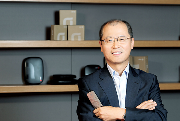
The man tasked with realizing the ambitions of the CEO is Kim Il-young, the 56-year-old executive vice president of KT. The JoongAng Ilbo sat down with Kim last week at the KT Center in Gwanghwamun, central Seoul.
Kim studied engineering at the University of London and worked at British Telecom for 27 years. Since 2008, he has been working as vice president as well as a chief officer of the design project, unifying the design concept of the company, ranging from the company’s logo and competitive intelligence to designing the company’s buildings.
Behind the KT Center in Gwanghwamun, a new building is being constructed that is scheduled to be completed by 2014. Kim said, pointing to the construction site, that “the new building will be the last word in KT’s design management. Its first floor and the rooftop will be open to the public and be used as a multi-entertainment area.”
The design of the new building is the work of Italian architect Renzo Piano, who sought to turn the building into a landmark in the Gwanghwamun area.
“He is best known for high-tech public spaces and he is the one who designed the Centre Georges Pompidou in Paris,” explained Kim.
KT decided to open the first floor of its headquarters to the public as the “Olleh Square,” which is an open space for the public to experience the company’s products and services (like that of an Apple Store). This is the first outcome of the company’s design project.
“When we were discussing the launch of the Olleh Square, there was some opposition voicing concerns about the company’s security and controlling visitor access,” Kim said. “But after opening Olleh Square to the public, that was nothing to worry about. Visitors are just busy trying to get their hands on the newest ICT.”
But what exactly is a telecom company trying to achieve through design management?
Kim says there are two goals: Achieving sustained growth and launching a new business model based on telecommunications convergence. It’s not just Apple and BMW that have been developing through innovation.
In Korea, Samsung Electronics and Hyundai Card have also been aggressive in design management. Samsung Electronics increased the number of employees at its design center this year to 1,000 and contracted with Chris Bangle, the former design chief of BMW Group who is one of the top three designers in automotive history, for the design of the company’s household appliances.
Hyundai Card also improved its image by designing credit cards that are now in solid colors with large characters to distinguish them from other cards. After turning the company upside down and redoing everything from corporate identity to card design, Hyundai Card began operating in the black in 2005 and is one of the front-runners in the industry today.
According to Kim, design management was essential for KT, which had limitations as a telecom company, to position itself as a “mobile content provider.”
KT hopes to break away from the limitations of a telecom company through design. It has been transferring its main network from telephones to its mobile Internet network.
“We are planning to establish a subsidiary for content [KT Media] and our satellite business [SAT],” Kim said.
For KT, the design-centered management philosophy comes from “reversing ideas.”
Pointing to the company’s logo on the main entrance of the KT Center, Kim said “this Olleh logo has a reversed idea” as it reads “hello” backwards. Kim said he wanted to have the “heartwarming image of greeting each other.” The new color for the logo was also chosen from the opposite color - from blue to red.
“Blue is a cold color that has a high-tech image, while red is a warm color that is also passionate,” explained Kim. “It means that KT wants to form a relationship with its consumers person-to -person rather than technology-to-person.”
Telecommunication offices located throughout the country were the image that was associated with KT, which used to be called Korea Telecom in Korean. But Kim says all 287 offices scattered around the country will be redesigned one after another starting next year.
“The buildings look like public institutions that people visit only when there’s a problem. From early next year, we’ll change the image of the offices to make it look like a place where everyone can come and enjoy their time,” said Kim. “This changed image will definitely pay off.”
But Kim admits that “innovation is painful.”
“There always follows pains and complaints for a change to take place. There is discontent behind the investments or disposing of KT’s properties. But I have to say that we have to make use of the company’s assets to invest in new business models.”
By Lee Won-ho [sharon@joongang.co.kr]


with the Korea JoongAng Daily
To write comments, please log in to one of the accounts.
Standards Board Policy (0/250자)