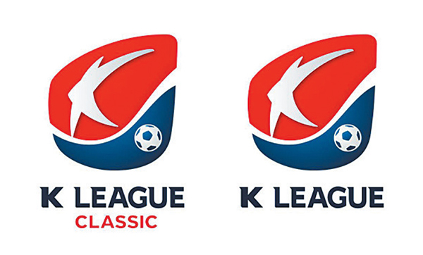
Top football competition adopts new names, logo

Starting this year, the first division will be called the K League Classic, officials said. Previously, the competition had the hyphenated name, the K-League.
The second-tier circuit, which will be introduced for the first time this year, will be simply called the K League.
The new logo is colored in red and blue, the colors of the “taegeuk” emblem at the center of the Korean national flag. The logo features the alphabet letter “K” painted over a red background and a football on a blue background.
According to officials, the color red represents football fans’ passionate support for the league, while the blue color was used to express the K League’s status as Asia’s top professional football competition.
Officials said these changes are part of the league-wide celebration of its 30th anniversary in 2013.
At the ceremony unveiling the names and the logo, Chung Mong-kyu, the league commissioner, said the name “Classic” was chosen to help portray the K League as a top-quality, exemplary and timeless football competition. The English word is also easy to pronounce for many Korean fans, Chung added.
“We wanted to inherit the tradition and values of professional football in this country, and at the same time, we wanted to convey our willingness to take on new challenges,” Chung said. “We thought long and hard over different ideas so that our names and logo will be beloved by many fans of our sport.”
In 2012, 16 clubs competed in what was then called the K-League, and two teams were relegated to the second division. Yonhap


with the Korea JoongAng Daily
To write comments, please log in to one of the accounts.
Standards Board Policy (0/250자)