

Olympic complex sports coat of many colors
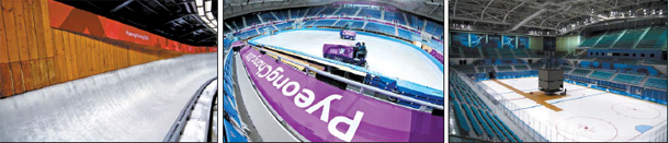
From left, the sliding track at the Olympic Sliding Centre with red banners, Gangneung Ice Arena with purple and Kwandong Hockey Centre with blue. All twelve venues will be decorated with banners from six different colors. Workers at the ice arena will also wear purple uniforms to match for the theme. [YONHAP]
Each stadium, arena and slope will feature a different color scheme depending on the sport played. “We wanted to use a color that reflected the essence of each sport,” said Park Jae-woo, manager of the creative design team under venue operations at the PyeongChang Organizing Committee for the 2018 Olympic and Paralympic Games.
The Gangneung and Kwandong Hockey Centres will have blue banners with the words PyeongChang 2018, while Gangneung Ice Arena will be decorated with purple banners.
The Alpensia Ski Jumping Centre and Olympic Sliding Centre, where the bobsled, skeleton and luge races will take place, will be ornamented in red.
Viewers will see teal green banners at the Alpensia Cross Country Centre and Biatholon Centre, while the Gangneung Curling Center, Yongpyong Alpine Centre, Jeongseon Alpine Centre and Phoenix Snow Park, where freestyle skiing and snowboarding matches are taking place, will sport orange banners.
Green will be used for medical facilities and other venues where athletic events are not taking places.
“Blue represents ice hockey’s speed and strength; red symbolizes the speed and passion of the ski jump and sliding sports; purple stands for the elegance of skating; and orange reflects the youthful audience of alpine skiing, freestyle skiing, snowboarding and curling,” Park explained.
Local organizers have been working with the International Olympic Committee and Olympic Broadcasting Services since the end of 2014 to select the color and look for the PyeongChang Winter Games, but the team was not always in agreement with the selected colors and switched some of them throughout their preparation.
“Initially, we chose red for ice hockey,” Park said, “but some people argued that red would aggravate athletes who are already in physical duress during games, so we switched to blue.”
Park also mentioned that the team had to take into consideration the Olympic Broadcasting Services’ request that chosen colors fit the aesthetics of ultra-high-definition standards.
Besides the banner colors, the background design is notable for its influence from Korean letters. It represents the first time that the background design of any Olympic banner has been inscribed with the host nation’s script.
In this modern age focused on sleek marketing, the aesthetic of each Olympic Games has been getting widespread attention. For the 2012 Summer Games in London, Olympic designers used bold colors to convey youthful energy. Brazil attempted to create an environmentally-friendly image by using a lot of green for their design during the 2016 Rio Games.
But designs that stick to one color per banner, like at the PyeongChang Olympics, grab greater attention.
“Messages on banners are more accurately delivered when using a single background color rather than several,” said Kim Jung-hae, head of NDM Color Institute. “That is why designing with simple colors is becoming a trend.
“One can say that the trend coincides with cultures that value affection.”
BY KIM JI-HAN [song.hankyul@joongang.co.kr]


with the Korea JoongAng Daily
To write comments, please log in to one of the accounts.
Standards Board Policy (0/250자)