

TED fellow says visualizing data can help change habits
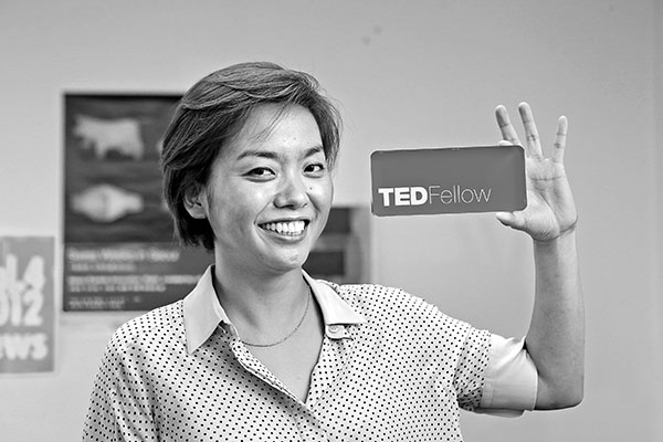
Sey Min shows the nameplate she received from TED as a souvenir. Min is a senior fellow. By Choi Jeong-dong
Sey Min, a 37-year-old TED fellow, is working on something that spans seemingly every field, from fine arts to design, mathematics, physics and social sciences. It’s called data visualization, but it is far from drawing a line graph or a pie chart.
“Data visualization is not only making graphics to help people understand information easily, but it’s also about changing behavior,” Min said in a recent interview with the JoongAng Sunday.
She presented her ideas about data visualization at a TED conference in Long Beach, California, last year, as the first Korean TED fellow. The title of the presentation was “Good Things About Playing With It.”
TED, an acronym for technology, entertainment and design, is a global series of conferences at which various experts give 18-minute lectures on a wide range of topics. Past speakers include Bill Clinton and Bill Gates. The videos are spread online through YouTube and the TED Web site.
The conference picks about 40 young innovators as TED fellows annually. The fellowship lasts for a year and upon its completion, about 10 get two-year senior fellowships.
Min was granted a senior fellowship this year. In June, Min presented ideas about making data visual and physical at TED Global, a European version of TED, in Edinburgh.
Min says that, since her TED talks at Long Beach last year, she has received offers to work at several multinational corporations, including AT&T and GE.
“My whole life has changed ever since I became a TED fellow,” she said. “Most of all, people have come to trust my words a lot more. And when I visit companies for business, now I can talk with the officials of a much higher ranking.”
After her high school graduation in Korea, Min received a degree in communications design from Texas Christian University and a master’s degree in computer graphics and interactive media from the Pratt Institute in New York.
Min really started to concentrate on data visualization when she was working as a researcher at the MIT SENSEable City Lab. After returning to Korea, Min worked at several companies including the nation’s biggest Web portal, Naver.
In 2008, along with several of her coworkers, Min launched the media art studio Random Walks in Seoul for data visualization.
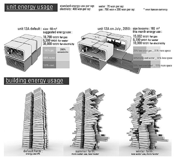
Min’s “data formation” idea in which apartment units’ areas change depending on the level of energy consumption. Provided by Sev Min
But what exactly is data visualization? As an example, Min talked about “data formation,” which she introduced in 2009 and also discussed in last year’s TED talks.
The program features a futuristic apartment building where units’ areas change depending on their consumption of water, gas and electricity.
It supposes that there is a proper amount of energy consumption for an apartment unit that has a size of 90 square meters (970 square feet).
“What would happen if the apartment’s area increased by 20 percent, when the family living in it consumes 20 percent less than the proper gas consumption amount? And what if the apartment area reduced 30 percent when the family uses 30 percent more than the proper water consumption amount?” Min asked.
“Then people living in the apartment would become more aware of wasting energy.”
“It doesn’t always have to be about the change in the space,” she added. “There is also a way of installing LED lighting on the outer wall of the apartment building, so that, the outer walls of homes that save energy can have light colors.”
Data visualization is also effective in showing actions that we do without thinking but which eventually have a major impact, Min said.
An example is the “data currency” she introduced at the Gwangju Design Biennale last year and also presented in TED Global this year.
Through the program, the amount of data appearing on a computer monitor is transformed into energy. Then, the energy runs a knitting machine, set on the right side of the computer monitor, to knit a scarf.
“One day I was hit by the idea that the scene of a sewing factory in old days is similar to the scene of an office filled with computers,” she said. “Inspired by it, I made the program.”
“It’s hard to know how much data we have seen, when we are on Facebook or search the Internet,” she continued. “Even if we hear the related figures such as data of 250 gigabytes or 1 terabyte, we cannot easily realize how much they are.
“But if I show that the data amount is equal to the energy amount used to knit a muffler to a certain length, it becomes quite substantial. And we should discuss its usage for a better future.”
Min said that data visualization is all about working the left and right sides of the brain, and it consists of a unity of knowledge that is controlled and comprised of technology, art and design.
Furthermore, it is about attempting to find an answer to a self-made question. So in order to work in this area, one has to be interested in fundamentally everything including social issues, arts, design, mathematics and liberal arts and sciences, she said.
By Ki Sun-min [estyle@joongang.co.kr]


with the Korea JoongAng Daily
To write comments, please log in to one of the accounts.
Standards Board Policy (0/250자)