

Lotte ditches old logo to raise profile
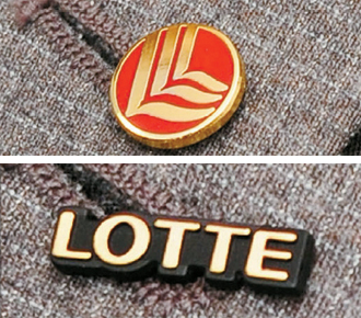
Lotte Group’s past, left, and present corporate logos Provided by the group
All Lotte employees and executives used to wear a badge featuring three white L’s that formed a wave-like pattern on top of a red circle. While the image was eye-catching, the identity of the brand it represented was all but impossible to guess.
According to group officials, the circle symbolized the earth, while the three L’s symbolized Lotte’s corporate spirit of Love, Liberty and Life. However, they decided to replace the old logo with the more prosaic choice of the word Lotte in simple black and gold.
“This will help Lotte make another leap forward as a global brand,” Lotte Chairman Shin Dong-bin told executives on Friday. All Lotte staff will wear the new badge starting this month. The group, which has headquarters in both Korea and Japan, previously used different corporate logos, but this will be the first time they have adopted the same one, the officials said.
“The new logo shows the company’s commitment to fulfill a goal it set in 2009 to become Asia’s 10th-largest conglomerate by 2018 by seeking aggressive global expansion,” said spokesman Park Sang-seob.
While big companies normally ask leading design companies to create a corporate logo, Lotte handed the mission to its own advertising agency, Daehong.
The agency created 20 new logos and the winner was chosen by a vote among 200 employees.
Lotte insiders said the move reflects the so-called geohwa chwisil management philosophy of Lotte Chairman Shin Dong-bin, the eldest son of founder Shin Kyuk-ho. Both men have adopted the same leadership style.
The phrase, which has its roots in Chinese characters, translates as “strive to ensure substantiality while avoiding ostentation.”
By Kim Mi-ju [mijukim@joongang.co.kr]


with the Korea JoongAng Daily
To write comments, please log in to one of the accounts.
Standards Board Policy (0/250자)