

How about a new currency design?
The author is the head of the financial planning team of the JoongAng Ilbo.
The product called “currency” is unique. Its value is predetermined regardless of the quality. People want to have more of it no matter how poor the paper is or how bad the design may be. Its exchange value is great, but utility value is virtually non-existent.
If so, do we need to think about design at all? If the design does not determine the value, it doesn’t matter what it looks like. When I asked this question a few years ago, I got an impressive response from a designer at Korea Minting, Security Printing & ID Card Operating. “It is actually harder to design because consumers have no choice. I need to find a design that resonates with as many people as possible,” he said.
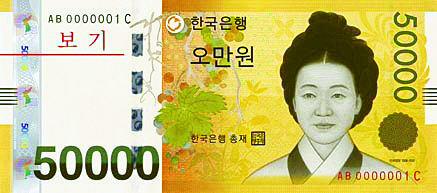
As all citizens are consumers of currency, there are many controversies over design. When the 50,000 won ($45) bills was first issued in 2009, it was controversial from the beginning, starting with the portrait selection. After the Bank of Korea (BOK) conducted a survey, an “ancestral fight” started online. When Sinsaimdang, a great woman of the Joseon Dynasty (1392-1910), was finally selected, women’s groups protested that it reinforced traditional gender roles. When the design was released, criticisms poured in that Simsaimdang was depicted like a gisaeng, or female entertainer.
Similar controversies occurred when new 1,000 and 10,000 won bills were introduced in 2007. More than half of the respondents preferred old designs over new. Taxi drivers complained that new 1,000 won bills, which used to be red, were changed to a bluish hue and it caused confusion with the green 10,000 won bills.
The BOK announced a design change again, but this time, not about the portrait selection or design itself but about the artist. The design of Admiral Yi Sun-shin on the 100 won coin is to be changed due to the original artist’s history of collaborating with Japan. The selection of the face on the currency is a complicated process as the figure, design and artist have to be perfect.
Using a historic figure on a currency design enhances authority and trust of the currency. However, it does not have to be a person, as the euro currency features bridges and gates. Norwegian notes are considered to feature a great design representing national identity with a lighthouse, fish and boats on the front and pixelated abstract images of the sea on the back. How about we deviate from selecting a person and seek a completely new currency design?


with the Korea JoongAng Daily
To write comments, please log in to one of the accounts.
Standards Board Policy (0/250자)