Fonts and faces at typography biennale: Interactive exhibition features characters from across the world
Published: 14 Oct. 2019, 18:49

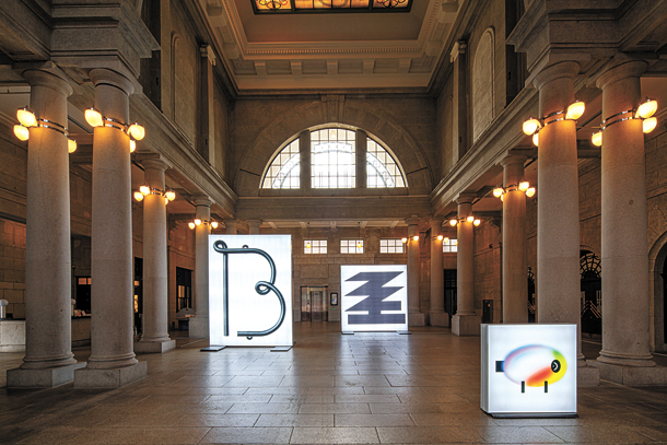
Typojanchi 2019, the world’s only biennale on typography, runs through Nov. 3 at Culture Station Seoul 284. [KCDF]
But unlike previous editions, this year’s focus isn’t only on letters.
“When people hear the term typography, they may just think of the letters, but it’s really the technique of utilizing letters rather than the letters themselves,” said Park Woo-hyuk, the co-director of Typojanchi 2019, the sixth International Typography Biennale. “This exhibition will combine images and symbols as well as letters in the behavior of typography.”
This exhibition, titled “Typography and Objects,” is divided into six categories - kaleidoscopes, polyhedrons, clocks, corners, sundries, and plants - that demonstrate how objects can be divided, sorted, combined and composed like letters in typography.
“When you look inside a kaleidoscope, it’s made of various colored shapes. Like how the colored shapes combine to create different patterns within the kaleidoscope, in this section, words are formed as a mix of different images,” Park explained.
Noh Eun-you, the curator and a contributing artist for the plants section, added that works in plants show how “letters become words, which become sentences, like the cycles of a plant.” Here, artists not only experimented with changing sentence length but also manipulating characters, notably through “Variable Fonts,” a tool used by designers to adjust a font’s weight and width.

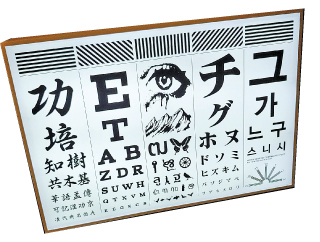
“an eye chart” by Mat-kkal. [KIM EUN-JIN]
Typojanchi, which means “festival of type” in Korean, is a Korea-based event hosted by the Ministry of Culture, Sports and Tourism and organized by the Korea Craft & Design Foundation (KCDF).
Despite its strong foundation in the country and professed goal to “tell the world of the excellent modelling of hangul and its cultural value,” this edition makes notable efforts to highlight the alphabets of non-Korean communities as well.
“Type Forest,” a dark, tunnel-like installation in the plants section, best showcases the beauty of different characters from across the world. Here, nouns written in various alphabets including Cyrillic, Japanese and Arabic, harmonize with verbs in Korean to form wistful statements like “the wind blows gently.”
Some 39 artists and teams from abroad including Australia, Finland and France contributed to “Type Forest” and other works.
As the event is held in the vast halls and rooms within Culture Station Seoul 284, the old Seoul Station, the exhibition takes on the appearance of an expo and makes it possible for visitors to invest a lot of time in viewing each work.

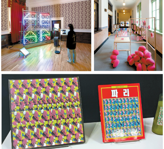
“FaceReader” by Everyday Practice (top left); “Mascotte” by Sangah Shin and Jaejin Ee (top right); Autostereograms “Two Layers” by BOWYER (above). [KCDF, KIM EUN-JIN]
A plethora of interactive activities across the exhibition add to its enjoyment.
“FaceReader,” located in the first floor’s polyhedrons section, reads and analyzes the audience’s facial expressions and displays them as unique symbols on a LED-lit monitor.
“Neutral,” by Ayong Son, gives visitors a chance to become the artists themselves. Dozens of pieces of paper are strewn on the floor, featuring two illustrations - an apple and a pear, for example - on either side of the page, and it’s up to the audience to fill out the symbol or image that they think will strike the right balance between the two drawings.
Visitors might get a little frustrated with themselves at the sundries section, however, which features several autostereograms, or optical illusions that hide a three-dimensional image behind a dizzying pattern of two-dimensional images that can only be seen with careful concentration. Described as “typographic symbol play,” the work “Two Layers” comes from local graphic design studio BOWYER.
Organizers of this year’s biennale are also using social media to the maximum to engage millennials, who make up a large chunk of all visitors. Instagram users get an opportunity to directly ask questions to participating artists on the exhibition’s official page, and on Hangul Day, which fell on last Wednesday during opening week, visitors qualified to win trendy merchandise if they uploaded pictures that celebrated the creation of the national language.
These digital efforts appear to have already paid off - Typojanchi’s Instagram page boasts a remarkable 10,900 followers, in contrast to the 3,800 for the Gwangju Biennale, Korea’s large biennial art exhibition.
Choi Bong-hyun, President of the KCDF, expressed his wish for the exhibition to appeal to visitors of all backgrounds and ages.
“The International Typography Biennale has already established itself as an exhibition that people in the design and art field view at least two times each, and we expect it to become a must-visit spot for families, couples and individuals.”
BY KIM EUN-JIN [kim.eunjin1@joongang.co.kr]
The exhibition runs through Nov. 3 at the Culture Station Seoul 284, which is located next to the Seoul Station in central Seoul. It opens everyday from 10 a.m. to 7 p.m. Admission is free.


with the Korea JoongAng Daily
To write comments, please log in to one of the accounts.
Standards Board Policy (0/250자)